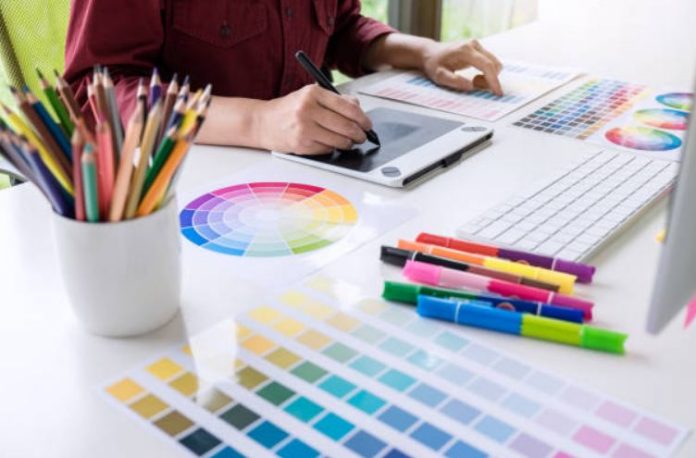
Colors have an amazing impact on our lives. From the red of our stop signs and traffic lights to the ever-important green of a dollar bill, color is integrated into every facet of our daily adventures.
Nowhere is this more clear, than in our art and in our artistic creativity.
Artists and designers are able to use color as a tool to capture our moods and emotions, to identify shapes and objects, and to convey messages.
They use color almost like a gardener uses a shovel to dig in the soil. They poke us and prod us with harsh or depressing color mixtures, and they gently sway us or quiet our spirits with subdued or gentle pallets.
Color can actually be the strongest element in any piece of artwork, due to the way it affects us on so many levels.
So, how about we look at a couple of the strategies for using color in our creative outlets and our designs, to have the greatest impact on our viewers and to help us become even more inspired.
Color adds a lot to any design, so we must be confident in our expression and use of it. There is a lot to learn from basic design theory, about color, so make sure you study color concepts thoroughly.
For now, let us focus on two basics…
1. Experimentation is one of your most powerful strategies in using color. Never be afraid to try anything, with color, in your art. Discover relationships between different colors.
Explore playful, soft, dark, bright, vibrant, and any other mixture of a color with a fresh, new eye towards inspiration.
Now, just to bring sanity back to the table, before you add new colors and inspirations to any piece you are already working on, please test your colors and combinations first. But the concept still rings true… experiment with and explore new colors.
2. Color wheels are another essential tool in any artist’s arsenal.
Color wheels, paint chips, or even color reference books, like the “Pantone Guide to Communicating with Color“, or “Color Index: Over 1100 Color Combinations”, simplify the process of choosing colors by providing a reference for how colors work together.
There is way too much to cover here, to make a color wheel understandable. Suffice it to say, whether you are a painter, a photographer, or any other artist, you will want some kind of color wheel, or color reference book, to help you get clarity on how colors relate and work together.
The most important thing to remember about working with color, in all your creative exploration, is to know that there is not, and may never be a perfect combination.
But, you can be confident in your own creative expression and artwork, if you will find colors that you enjoy, and that do not go against your own perception of great creative design.

