

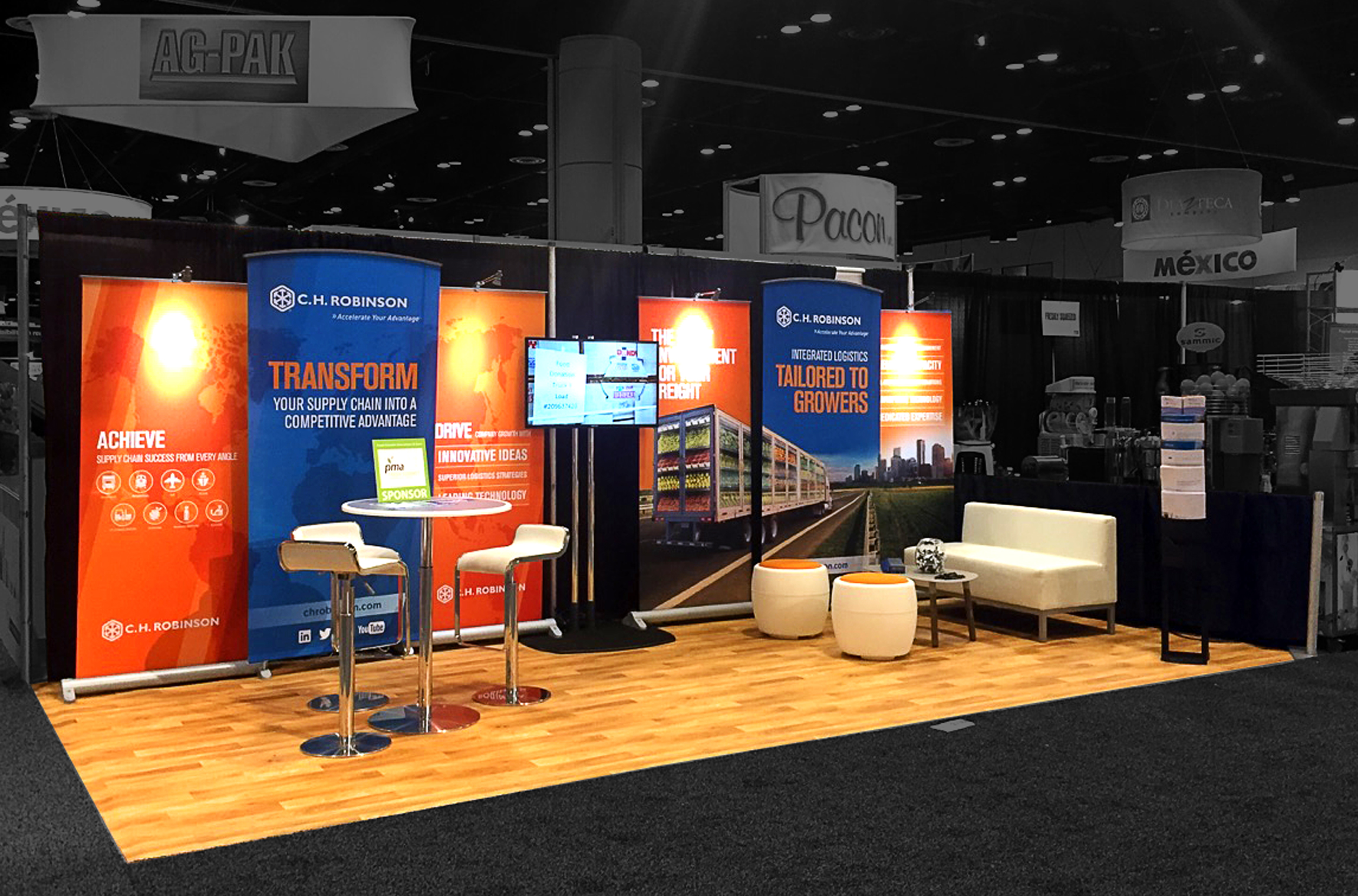
Ninety percent of your booth budget disappears before the show floor even opens. Floor space, freight, labor, carpet, electricity, badges, the hotel nobody wanted to book. By the time a stranger walks past your display, most of that money has already been spent, and you get roughly three seconds to justify it.
I’ve walked show floors from Las Vegas to Chicago, and the pattern never changes. The busy booths aren’t the flashiest ones. They’re the ones where a stranger understands, in one glance, what the company does and why stopping is worth ten minutes of their day. That’s the whole job of booth design, and it’s more mechanical than most marketing teams want to admit.
Here’s what I’ll cover: where money actually moves the needle, a framework I call FLOOR for laying out a booth people walk into rather than past, and the mistakes that make even expensive builds feel invisible.
What separates a busy booth from an ignored one?
Attention, and it’s measurable in behavior. The booths that draw crowds almost always sit at a corner or aisle end, carry one dominant message instead of five, and keep at least one staffer standing out front rather than hiding behind a counter.
Everything else is decoration. Companies obsess over whether the arch should be brushed aluminum or matte black while their signage lists eight services in a font nobody over forty can read from fifteen feet away. I’ve watched a six-figure build get skipped by hundreds of attendees because the back wall looked like a résumé.
Restraint wins. Pick the message a stranger needs in the first second. Everything else is a second-date conversation.
The FLOOR framework for laying out booth space
Every booth problem I’ve seen on a show floor lands in one of five buckets. Work through them in order and the layout mostly designs itself.
- What does someone see from thirty feet away? One logo, one idea. That’s it.
- Directional light on the signage, warm light inside the meeting space, nothing aimed at the aisle or a neighboring booth.
- Leave at least one full side unblocked. A table across the entire front edge is a wall, not a welcome.
- Your staff’s standing zones should be mapped before the show. Badge scanners, storage, power cables, and lead capture all take real square footage.
- Reason to stay. A demo, a charging station, a short game, or a scheduled talk creates an actual moment. Free pens don’t.
I’d rather you spend a full day on F and O than argue with a vendor about the fabric tension on your back wall. Nobody in the aisle will ever notice the fabric.
The overlooked math behind show floor performance
Trade shows sit inside a venue industry that supports a lot of American jobs. According to the Bureau of Labor Statistics, food preparation and serving occupations remain among the largest employment groups in the country, and convention centers in major cities run on exactly that kind of event staffing. That matters for your planning because labor, load-in windows, and crew availability often drive what your booth can physically be.
In other words, budget constraints and union schedules shape design more than taste does. I’ve seen beautiful concepts get scrapped because the install window simply wouldn’t allow a two-deck structure. Ask what’s possible before you sketch anything.
Design ideas that work in any industry
The target page I’d point you to makes this exact argument: medical exhibitors sell credibility, technology companies sell demonstration, and consumer brands sell spectacle. Same floor, three completely different builds. What doesn’t change is the mechanics underneath.
Modular beats monumental
A system you can rearrange for a 10 by 10 one month and a 20 by 20 the next stretches your money further. I’d take a flexible modular rental over a custom build you can only use once. Every time.
Meeting space pays for itself
A small enclosed room with four chairs turns a casual walk-by into a real conversation. Quiet space is a feature, especially at loud shows. It’s the cheapest upgrade most exhibitors skip.
Light and motion first
Bright, well-aimed light and simple motion catch peripheral vision before any copy does. That’s why LED walls and hanging signs pull crowds while a heavier banner does almost nothing. Rent the visual punch if you can’t buy it. For teams planning exactly that kind of layout, working with specialists in trade show booth design for your specific industry lets you match the build to how your buyers actually behave.
A pre-show checklist worth laminating
Run through this a week before the show. It’s short on purpose.
- Read your main sign from fifteen feet. If you squint, redo it.
- Walk your own layout and count the steps from aisle to your staff. More than five means people will stop at the edge and drift.
- Confirm your lead capture works offline. Convention center Wi-Fi is a coin flip.
- Brief every staffer on the one-line answer to “what do you do,” and make sure the answers match.
- Pack a toolkit, tape, extra power strips, and a spare cable for the demo you can’t afford to lose.
Small businesses build a fair amount of this muscle already. The Small Business Administration has long emphasized that trade shows and outbound selling give smaller firms access to buyers they couldn’t reach otherwise, which is exactly why a clean, focused booth beats an expensive, confusing one.
Mistakes I see over and over
Too many logos competing for the same eyeball. Staff eating lunch at the front table. A prize wheel with a line of people who will never buy anything. Harsh lighting that makes visitors wince and walk on.
The quiet killer, though, is treating the booth as a design project instead of a sales tool. Pretty doesn’t close deals. Readable, walkable, well-staffed spaces do.
Designers have known this longer than the exhibit industry has existed. The Smithsonian Magazine has written about how museums shape visitor movement through a room, and the principle translates directly: people follow sightlines, and they stop where there’s something to look at. Your booth is a small museum exhibit with a purchase order at the end.
Where to spend your next dollar
If you’re building your first booth, put money into signage visibility, lighting, and floor space for people to stand. Rent whatever else you can. If you’re upgrading an existing booth, fix readability before you add anything new. That sounds unglamorous. It consistently produces the best results.
Your booth has one job on the floor, and it isn’t looking impressive in the photo your marketing team posts afterward. It’s making a stranger stop, understand, and step inside. So before your next show, stand where a passerby would stand, count to three, and ask yourself honestly what you’d do. Then design for that person, not for the render.
